| |
 01-20-2008, 02:32 AM
| #1 |
| Web Wheeling   Join Date: Jan 2005 Location: Twin Cities
Posts: 3,004
|
Still need to clean up the edges of the jeep, and might look at other fonts as well. Let me know what you think of the colors and over all design, its late and I am going to bed soon. |

|  |
| Sponsored Links | |
| | |
|
01-20-2008, 02:55 AM
| #2 |
| MWRCA'er  Join Date: Apr 2004 Location: Machesney Park IL
Posts: 3,995
|
I don't mean this in disrespect but I sort of liked the other one as it was more generic. It could have been anybodys truck, thus everyone could relate to it better. That is hard to do though, all of my logo's MWRCA logos are of my crappy trucks from years ago. Not sure if I'm real big on the round seal look either.:neutral: Maybe its just the massive tires throwing me off. |
|
| |
|
01-20-2008, 05:51 AM
| #3 |
| Rock Stacker Join Date: Apr 2006 Location: Cannon Falls
Posts: 74
|
I like it  Should br a picture of my truck though Should br a picture of my truck though |
|
| |
|
01-20-2008, 08:19 AM
| #4 |
| Quarry Creeper Join Date: Oct 2007 Location: PF, WI
Posts: 490
|
I like it. Just one possible idea. Is there any way to make the circle look like the sidewall of a tire? I dont know how hard that would be. Also a good friend of my family has a sign making company so I may be able to get a deal on vinyl decals and stuff if you want.
|
|
| |
|
01-20-2008, 09:03 AM
| #5 |
| I wanna be Dave Join Date: Jul 2005 Location: Cedar Rapids
Posts: 2,028
|
It look ok, but I don't like the jeep on there. I do like the circle and state also a big fan of simple fonts. Give it to your sister to do I really like my logo. Maybe make just a tire coming over a rock instead of the whole jeep that has textured hard doors. |
|
| |
|
01-20-2008, 09:57 AM
| #6 |
| Web Wheeling Join Date: Jan 2005 Location: Twin Cities
Posts: 3,004
|
I will look through my pictures today and see what other good shots I have of other rigs that are not bug bodys, and have good lighting. I like the tire sidewall idea too, I will take some shots of tires today and work with that as well. This was just the start, and I knew it would need more work but wanted some feedback first. I am doing all the graphics work with Illustrator as wel, so we can have it printed by any shop in any size. Everything is vector based, even the jeep |
|
| |
|
01-20-2008, 11:33 AM
| #7 |
| I wanna be Dave Join Date: May 2007 Location: Taylors Falls just hanging with the MNRCRC crew.
Posts: 7,843
|
Hey Mike, that looks awesome IMO, I love the colors it has a vintage National Forest kind of look The Jeep is good IMO as well these would be nice in a 2.5" and scale size stickers for our vehicles large and small....I say move forward no need to change anything...Good Job |
|
| |
|
01-20-2008, 12:45 PM
| #8 |
| RCC Addict  Join Date: Apr 2006 Location: Minnehopeless
Posts: 1,129
| I like the general layout. I'm not too keen on the colors though; if we could use something more nuetral. That way it could be used with different paint schemes. Brown doesn't go too well with many other colors. What about just using an outline of a truck rather than an actual picture? Kind of like the rccrawler truck above. Like Mnster said, it'd be more generic and could be anybody's truck. |
|
| |
|
01-20-2008, 01:19 PM
| #9 |
| Rock Crawler Join Date: Apr 2006 Location: Eau Claire
Posts: 776
|
Looks good, but it should have the rig that took 1st Place last season. I think it would be a great lasting reminder of who got.................. 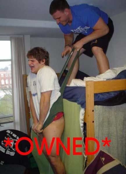 |
|
| |
|
01-20-2008, 01:32 PM
| #10 |
| Web Wheeling Join Date: Jan 2005 Location: Twin Cities
Posts: 3,004
|
Going to have my sister work on it... She is going to school for this crap and knows what she is doing, and knows what looks good. She told me her next assignment in school was to make a vector logo |
|
| |
|
01-20-2008, 01:35 PM
| #11 | |
| RCC Addict Join Date: Apr 2006 Location: Minnehopeless
Posts: 1,129
| Quote:
| |
|
| |
|
01-20-2008, 02:10 PM
| #12 | |
| I wanna be Dave Join Date: Jul 2005 Location: Cedar Rapids
Posts: 2,028
| Quote:
The rust she did on mine was awesome. | |
|
| |
|
01-20-2008, 03:26 PM
| #13 |
| Web Wheeling Join Date: Jan 2005 Location: Twin Cities
Posts: 3,004
|
I didn't want to slam it on her right away, just in case she was to busy with school work. She likes to put a lot of time into her school projects.
|
|
| |
|
01-20-2008, 03:28 PM
| #14 |
| Quarry Creeper Join Date: May 2005 Location: Twin Cities
Posts: 259
|
I'll have to agree with nickelpimp, I don't like all that brown.
|
|
| |
|
01-20-2008, 04:13 PM
| #15 |
| Rock Crawler Join Date: Feb 2007 Location: weather sucks ,mn
Posts: 680
|
looks great ....needs more color ...maybe gold and maroon for gopher colors
|
|
| |
|
01-20-2008, 05:30 PM
| #16 |
| Quarry Creeper Join Date: Jan 2007 Location: Isanti, MN
Posts: 289
|
i think that the jeep looks good, but it could use a rock under it instead of floating in the logo. maybe have a rock with the jeep on it, with about 3 pine trees and minnesota in the backround and also i like the tire sidewall ring idea. i'm sure you can figure it out.
|
|
| |
|
01-20-2008, 06:05 PM
| #17 |
| I wanna be Dave Join Date: May 2007 Location: Taylors Falls just hanging with the MNRCRC crew.
Posts: 7,843
|
I totally disagree the color is great it doesn't need to match your outfit Pimp, |
|
| |
|
01-20-2008, 06:15 PM
| #18 |
| Donkey Punch Champion!   Join Date: Oct 2006 Location: Minneapolis
Posts: 4,660
|
it looks ok...silly jeep.
|
|
| |
|
01-20-2008, 08:15 PM
| #19 |
| Quarry Creeper Join Date: Nov 2005 Location: Pueblo West
Posts: 250
|
i'm dig'n it mike , i would want one to toss in the windows of the van and my 1:1. by the way , where did this pic of t-man at summer camp come from, i heard they promoted the counselor in the blue shirt [/quote]
|
|
| |
|
01-20-2008, 09:01 PM
| #20 | |
| Quarry Creeper Join Date: Jan 2007 Location: Isanti, MN
Posts: 289
| Quote:
first of all i look nothing like that, secondly i never went to camp. and thirdly that picture is disgusting. I know your just kidding. its all | |
|
| |
 |
| Thread Tools | |
| Display Modes | |
| |


 Linear Mode


