| |
 10-27-2008, 10:38 AM
| #1 |
| Quarry Creeper Join Date: Sep 2005 Location: Creeping in the Dark!!!
Posts: 349
|
Ok my marketing guy for t.o. haas has a side businees on shirts he can make us t-shirts for a cost around 7.50 per shirt I was thinking gray shirts with the state outline & n.s.c.a across the outline & a outline of a crawler under that on the back & N.S.C.A on the front left side, I want to try & keep it simple so if anyone has any other ideas let me know
|

|  |
| Sponsored Links | |
| | |
|
10-27-2008, 10:59 AM
| #2 | |
| Rock Crawler Join Date: Sep 2007 Location: Omaha
Posts: 565
| Quote:
| |
|
| |
|
10-27-2008, 11:05 AM
| #3 |
| RCC Addict Join Date: Nov 2007 Location: in the woods
Posts: 1,915
|
Wow, you look fat in a color? Thats cool, girls are always welcome in the crawler club |
|
| |
|
10-27-2008, 11:10 AM
| #4 |
| Rock Crawler Join Date: Sep 2007 Location: Omaha
Posts: 565
|
Whatever! I am going to go cry because you have hurt my inner crawler... Back to business - is this the logo we are using? 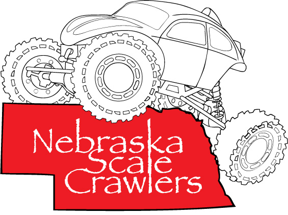 |
|
| |
|
10-27-2008, 11:18 AM
| #5 |
| RCC Addict Join Date: Nov 2007 Location: in the woods
Posts: 1,915
|
I am good with whatever, I am not picky.
|
|
| |
|
10-27-2008, 11:49 AM
| #6 |
| Quarry Creeper Join Date: Sep 2005 Location: Creeping in the Dark!!!
Posts: 349
|
I dont really like that, Do something like i was thinking state out line with nsca across it it dark green lettering with small out line of a crawler under that & nsca on front left!
Last edited by sniders1975; 10-27-2008 at 12:25 PM. |
|
| |
|
10-27-2008, 12:59 PM
| #7 |
| Rock Stacker Join Date: Nov 2004 Location: Omaha
Posts: 71
|
Let me work on it, ill have something shortly. should be easy, that was my original design |
|
| |
|
10-27-2008, 01:43 PM
| #8 |
| Rock Stacker Join Date: Nov 2004 Location: Omaha
Posts: 71
|  |
|
| |
|
10-27-2008, 02:14 PM
| #9 |
| Rock Stacker Join Date: Nov 2004 Location: Omaha
Posts: 71
|
for example on a shirt? I think we need to keep it to like 2 or 3 colors to keep cost down.  |
|
| |
|
10-27-2008, 03:09 PM
| #10 |
| Quarry Creeper Join Date: Jan 2008 Location: In the corn
Posts: 331
|   |
|
| |
|
10-27-2008, 03:36 PM
| #11 |
| Rock Crawler Join Date: Sep 2007 Location: Omaha
Posts: 565
|
I like that Brushstroke font a little better.
|
|
| |
|
10-27-2008, 05:11 PM
| #12 |
| Rock Crawler Join Date: Feb 2008 Location: Nebraska
Posts: 819
|
Looks great guys!  Are we going to put a vote up on these now? |
|
| |
|
10-27-2008, 05:51 PM
| #13 |
| Quarry Creeper Join Date: Sep 2005 Location: Creeping in the Dark!!!
Posts: 349
|
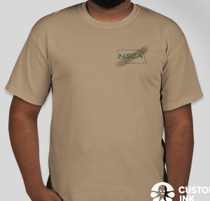
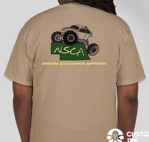
I like jesses idea but i told him to try something else use a brown t-shirt with the state in dark green & N.S.C.A across the state in yellow & really small nebraska scale crawlers under the state in yellow with a truck under that & on the front N.S.C.A on the left in green with small nebraska scale crawlers under that in yellow
|
|
| |
|
10-27-2008, 06:06 PM
| #14 |
| Quarry Creeper Join Date: Sep 2005 Location: Creeping in the Dark!!!
Posts: 349
|   I really like this what do you think?? I really like this what do you think??
|
|
| |
|
10-27-2008, 06:28 PM
| #15 |
| Rock Crawler Join Date: Sep 2007 Location: Omaha
Posts: 565
| http://www.customink.com/designs/sta...te=designfront Looks cool to me here is what I was talking about with a white on brown. Cheaper with just one color to print. I tried to do a state outline around this, but my wife is now yelling at me to come eat. Either way is good for me. I can mess around with this tomorrow at work. |
|
| |
|
10-27-2008, 07:26 PM
| #16 |
| Quarry Creeper Join Date: Jan 2008 Location: In the corn
Posts: 331
|   |
|
| |
|
10-28-2008, 11:01 AM
| #17 |
| Rock Stacker Join Date: Nov 2004 Location: Omaha
Posts: 71
| |
|
| |
|
10-28-2008, 12:00 PM
| #18 |
| Rock Crawler Join Date: Sep 2007 Location: Omaha
Posts: 565
|
That's it. I think that looks great.To drop a color and get down to two colors, I would put "Nebraska Scale Crawler Association in black or green and remove the color for the NSCA so the shirt color just shows through. However that would be tough on the CustomInk simulator. Now if we could get the track to look like Pro-Line Hammers. Last edited by stampedeproject; 10-28-2008 at 12:04 PM. |
|
| |
|
10-28-2008, 12:03 PM
| #19 |
| Quarry Creeper Join Date: Sep 2005 Location: Creeping in the Dark!!!
Posts: 349
|
Im sorry but i dont like that i do not like the crawler on the state to me its to much i want something more simple like what i have up top
|
|
| |
|
10-28-2008, 12:57 PM
| #20 |
| Rock Stacker Join Date: Nov 2004 Location: Omaha
Posts: 71
|
I have no problem with the simple idea, i just think its too simple, and there isnt enough consistancy. like there isnt really a logo. I could make the tires look like hammers. Im thinking we just may have to get a few designs together and take a vote. I like how you have just the letters on the front though |
|
| |
 |
| |


 Linear Mode


