| |
| |||||||
 |
| | LinkBack | Thread Tools | Display Modes |
 11-15-2010, 06:06 PM
| #1 |
| I wanna be Dave Join Date: Oct 2005 Location: EvilCrawlerDesigns@comcast.net
Posts: 3,510
|
I'm trying to design trophies for our club's points series. I have a friend with a CNC Plasma table, and hope to be able to cut the trophies out of 1/8" steel. I will then weld them to a base and paint them accordingly. What I need help with is finding some 2D images that I can use to cut out a free standing 2D trophie...it will need lines connecting all parts so it can stay together. Does anybody have anything that can work? Rocks, crawlers, trucks, etc... Maybe even a 1, 2, and a 3 along with alphabet letters (upper and lower case)? Thanks. |

|  |
| Sponsored Links | |
| | |
|
11-16-2010, 09:51 AM
| #2 |
| I wanna be Dave Join Date: Oct 2005 Location: EvilCrawlerDesigns@comcast.net
Posts: 3,510
|
Anybody have anything??? or any suggestions?
|
|
| |
|
11-16-2010, 10:51 AM
| #3 |
| Rock Crawler Join Date: Apr 2004 Location: North GA
Posts: 824
|
When I did the artwork for our clubs trophies a few years ago I found nice pics of the winners trucks and converted them into a "stamp" type image in Photoshop. These were then engraved on plaques, but you might be able to do something similar to get your cut lines. For the way we did our plaques the detail was nice, but you could make it less detailed for simplicity. 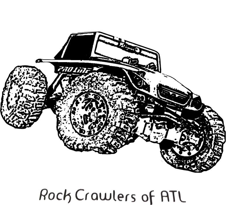 -Destroyer |
|
| |
|
11-16-2010, 11:16 AM
| #4 |
| Rock Crawler   Join Date: Jan 2010 Location: In the office, working on RC Projects!
Posts: 602
|
Are you thinking of something like this? If so, let me know, I'll make a 2nd and 3rd and send you an email with the files.
|
|
| |
|
11-16-2010, 12:55 PM
| #5 | |
| I wanna be Dave Join Date: Oct 2005 Location: EvilCrawlerDesigns@comcast.net
Posts: 3,510
| Quote:
I'm not sure about the cup, though, as I will probably need to cut some text into the body of it. I'm going to need to make these for both our summer and winter series and will need room to put the following in: For the winter series, I need room to have The Crawl Space 2010 Winter Series (and then the class) something like what I did below... I can work with it some with photoshop, but that's definately a start. Let me run it past our club president and see what he thinks. By the way, what font did you use for "1st"? Thanks for your help.  Last edited by EvilTwin v2; 11-16-2010 at 12:57 PM. | |
|
| |
|
11-16-2010, 02:36 PM
| #6 |
| I wanna be Dave Join Date: Oct 2005 Location: EvilCrawlerDesigns@comcast.net
Posts: 3,510
|
Actually, I'm thinking something more along the lines of this, but with a different font, and maybe better placement of the lettering. For some reason, it just doesn't feel right, either. Any suggestions? (I know I'll have to edit it a little so the letters will stay together.) |
|
| |
|
11-16-2010, 02:57 PM
| #7 |
| Pebble Pounder Join Date: Jan 2010 Location: Anaheim/Chico
Posts: 114
|
AHHHHH PAPYRUS! noooooo. I'm bored. Maybe i'll dick around with a trophy in illustrator with my free time today. |
|
| |
|
11-16-2010, 03:06 PM
| #8 |
| Rock Crawler Join Date: Apr 2009 Location: Pa
Posts: 563
|
Keep the text simple and keep in mind when piercing the steel the plasma will produce a larger kerf than when cutting normally.
|
|
| |
|
11-16-2010, 03:55 PM
| #9 |
| Rock Crawler Join Date: Jan 2010 Location: In the office, working on RC Projects!
Posts: 602
|
I just used Arial Black, simple clean lines. Now that I have a better idea of what you want, I've got a few designs in my head, no cups involved I'm at work right now, so as soon as i finish the jobs due today, I can work on the fun stuff. I'll post it up later tonight. |
|
| |
|
11-16-2010, 08:34 PM
| #10 |
| I wanna be Dave Join Date: Oct 2005 Location: EvilCrawlerDesigns@comcast.net
Posts: 3,510
|
I played around trying to get a better looking crawler. What do you think of this one?
Last edited by EvilTwin v2; 11-16-2010 at 08:40 PM. |
|
| |
|
11-16-2010, 11:34 PM
| #11 |
| Rock Crawler Join Date: Jan 2010 Location: In the office, working on RC Projects!
Posts: 602
|
This is what I came up with at work I left out the 2010 ... because I wanted to use a different font, but ran out of time before I found one I liked. |
|
| |
|
11-17-2010, 05:43 AM
| #12 | |
| I wanna be Dave Join Date: Oct 2005 Location: EvilCrawlerDesigns@comcast.net
Posts: 3,510
| Quote:
Can you send me the file...probably without the font. I'm pretty sure that the guy cutting it may need to use his own fonts that will cut properly. Thanks again! | |
|
| |
|
| |


 Linear Mode


